Theme Switcher with CSS Variables
Build a theme switcher that changes a card using CSS variables
5 upvotes
10 upvotes
The goal of this project is to teach you how to organize a stylesheet around design tokens and use CSS state to swap those tokens.
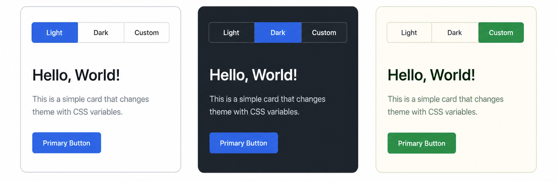
In this project, you are required to build a tiny UI that can switch between multiple themes using only HTML and CSS. Keep the interface basic: a row of three theme options and one preview card with a heading, short paragraph, and button.
The theme switch should work without JavaScript by using radio inputs with labels and either :has or sibling selectors. Below is a rough mockup showing the same card in three theme states.
Things to keep in mind
Tokens at
:root: Define a small token layer (--color-bg,--color-surface,--color-text,--color-accent,--radius-md, etc.) at:root.Theme variants: Override the same token names for light, dark, and one custom theme. The card should reference tokens, not hardcoded colors.
Switch without JavaScript: Use three radio inputs and labels for the theme options. Target the checked state with
:hasor the general sibling combinator.Keep the markup the same: The themes should change the look of the same preview card. Do not duplicate the card for each theme in your HTML.
Avoid hardcoded colors anywhere outside the token layer.
Requirements
At least three themes must be defined.
No JavaScript is allowed.
The switcher controls must be visible and keyboard accessible.
The same set of token names must be defined in every theme, so switching themes does not leave any token undefined.
After completing this project, you will understand how a small set of CSS variables can power several visual themes, and how CSS selectors can handle simple interface state without JavaScript.